
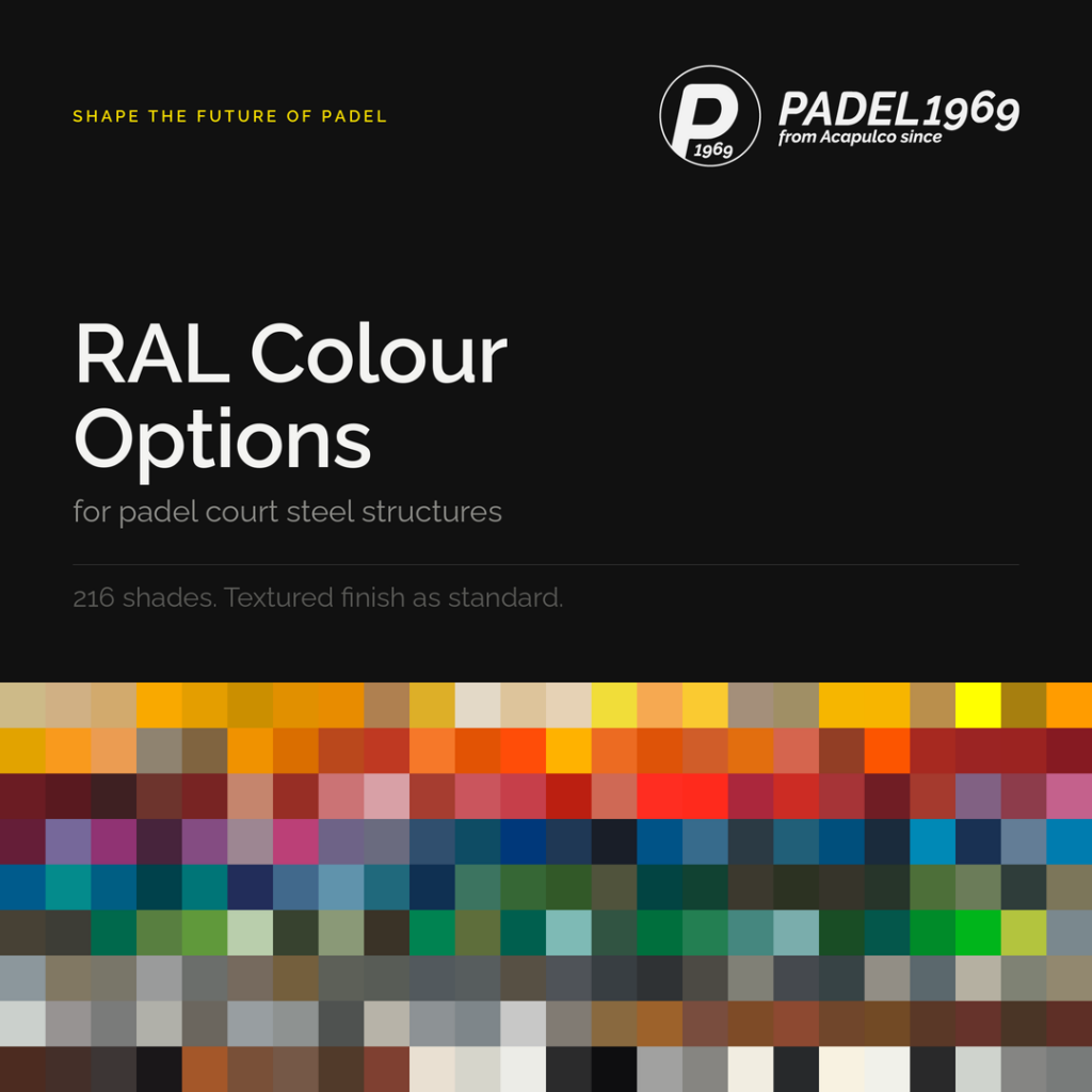
Colour is the first decision most clients enjoy making and the last one they think about carefully. It is also one of the few specification choices that is effectively permanent. The steel structure of a padel court is powder coated three layers, at the factory, before the glass is ever fitted. It will carry that shade for the working life of the court, which on a well built installation is measured in decades rather than seasons.
The short answer, before the detail: a dark, low gloss, textured shade is the safest specification for almost every padel court, and RAL 9005 jet black remains the reference point. It gives the highest contrast against the ball, it recedes visually so that the glass and the play read first, it photographs well under floodlight, and it is pigment stable enough to look correct in year ten. Everything that follows explains why, and where the exceptions genuinely lie.
Colour on a padel court is a functional decision first
A padel court is not a piece of furniture. It is a viewing frame. Every point is played through and against the structure, and every spectator, camera, and phone sees the court through the same frame. Four things are affected by the shade you choose, and only one of them is taste.
The first is ball tracking. A padel ball is optic yellow. Players read its flight against whatever sits behind it, which for most of a rally is the mesh, the posts, and the far structure. Contrast between ball and background is what makes the ball easy to pick up early. Dark structures maximise that contrast. Light structures reduce it, and saturated warm shades reduce it sharply.
The second is how the glass reads. Tempered glass is the defining surface of a padel court and it has a natural edge tint. A dark frame around glass reads as a thin line and disappears into the background, so the eye registers the glass and the play. A light or bright frame does the opposite. It advertises the structure and turns the glass into a series of panels held in a visible grid.
The third is light behaviour. Powder coating in a textured finish at gloss 3 to 7 scatters light rather than reflecting it. Dark shades in that finish absorb light and keep it out of the glass. Light and saturated shades bounce floodlight onto the glass and back into the field of vision, which is felt as glare rather than seen as colour.
The fourth is how the court ages. Colour is where the honest differences between shades appear, and it has almost nothing to do with how the swatch looks on a screen today.
Why black is a reliable choice
Black is not a default because it is easy. It is a default because it wins on every axis that matters over a long ownership period.
Ball contrast is the clearest advantage. Against RAL 9005 or RAL 9011, an optic yellow ball separates cleanly from the background at every height and every distance, including the low fast ball off the glass that players read late. No other family of shades does this as consistently.
Visual recession is the second advantage. A black structure stops competing for attention. What the eye registers instead is the surface, the glass, the players, and the space around the court. On panoramic courts, where the design intent is to remove visual obstruction, a dark frame is the only shade family that supports the intent rather than undermining it.
Camera performance is the third, and it is increasingly the reason clients raise the question at all. Clubs now film. Members film. A dark structure holds detail under floodlight and gives the sensor a stable reference, so footage looks controlled. Light structures blow out under the same lighting and pull exposure away from the players.
Pigment stability is the fourth. The pigments used in blacks, near blacks, and greys are inorganic and hold their appearance under ultraviolet exposure far better than the organic pigments needed for saturated reds, oranges, bright yellows, and vivid blues. A black court looks like a black court in year eight. A bright red court very often does not.
Longevity of the decision is the fifth. A court outlives brand identities. Clubs are renamed, repositioned, sold, and refurbished, and a black structure remains correct through all of it. It also accepts any brand palette applied around it, in flooring, seating, signage, and lighting, without argument.
Practical serviceability is the last. RAL 9005 and RAL 7016 are stocked, standard, and straightforward to match for touch up work years after delivery. Unusual shades are not, and a court that cannot be touched up correctly ages faster in appearance than in fact.
Where black is not automatically right
Two trade-offs are real and should be stated plainly rather than argued away.
Heat is the first. Dark coated steel absorbs solar radiation and reaches a higher surface temperature than light coated steel in the same conditions. On outdoor courts in the Gulf, in Africa, in southern Europe, and in any location with sustained direct sun, this is felt when a hand meets a post. It does not compromise a correctly engineered structure, because thermal movement is accounted for in the design, but it does affect comfort. In those climates, a mid grey such as RAL 7016 anthracite grey, RAL 7024 graphite grey, or RAL 7039 quartz grey retains most of the visual advantage of a dark structure while reducing absorbed heat.
Dust is the second. Light coloured dust, pollen, sand, and dried salt spray show clearly against a black surface. In coastal, desert, and agricultural settings, a black court needs washing more often to look as intended. Mid greys hide light dust and dark soiling more evenly than either extreme, which is why they are the most frequently specified alternative to black rather than any of the colour families.
How the colour families behave
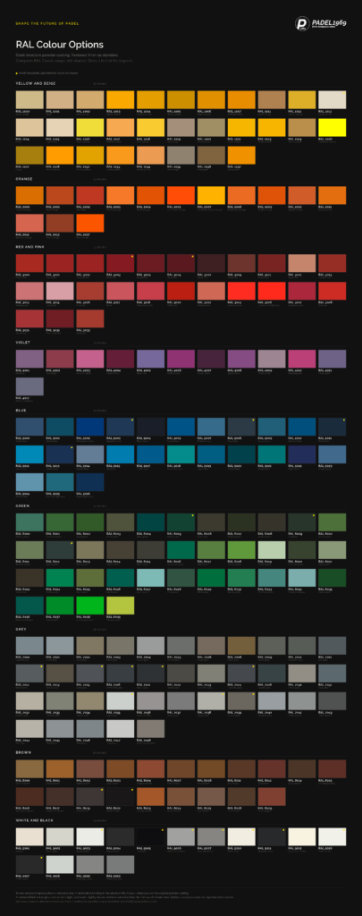
The full range is available, and the reason to publish it is transparency rather than encouragement. Most of it is not suited to a padel court, and the reasons are consistent enough to summarise by family.
| Family | Behaviour on a court | Position |
|---|---|---|
| Blacks and near blacks | Highest ball contrast, visually recessive, pigment stable, simple to service | The reference specification |
| Mid and dark greys | Close to black in contrast and stability, cooler in sun, more forgiving of dust | The considered alternative |
| Light greys and whites | Reduce ball contrast, reflect floodlight into the glass, show organic staining | Indoor and architectural cases only |
| Dark greens | Read as near black at playing distance, integrate into landscaped and forest settings | Well suited outdoors |
| Dark blues | Behave like near blacks, hold up reasonably under ultraviolet exposure | Acceptable with care |
| Deep reds and browns | Wine and oxide shades read dark and age acceptably | Acceptable in warm architectural settings |
| Bright reds, oranges, violets | Organic pigments, visible fade and chalking, date quickly | Not advised for structures |
| Saturated yellows | Directly reduce contrast against an optic yellow ball | Avoid |
The last line deserves emphasis because it is the one clients are surprised by. A yellow structure is the single specification that measurably works against the game being played inside it. It is a brand colour decision that costs the player the ball.
The core palette exists to shorten the decision
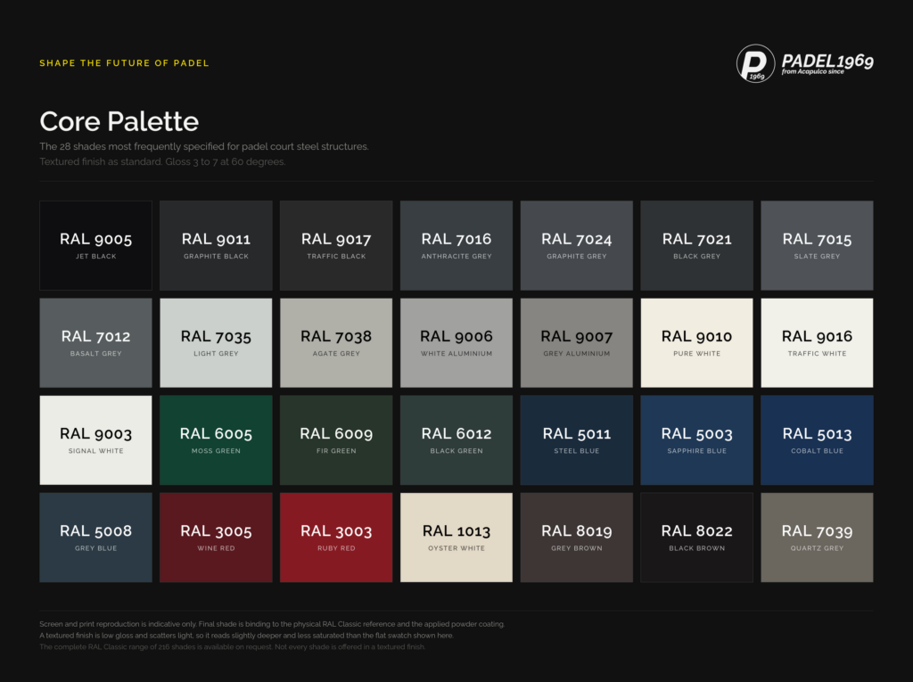
Twenty eight shades out of 216 account for the overwhelming majority of courts we build. That concentration is not a limitation imposed by manufacturing. It is what remains once the shades that fade, glare, overheat, date, or compete with the ball are removed.
Within the palette, the practical decision usually reduces to four positions. RAL 9005 jet black for the most absolute frame. RAL 9017 traffic black or RAL 9011 graphite black for a marginally softer black that reads less flat in strong daylight. RAL 7016 anthracite grey where architecture calls for a structure that is dark without being black, which is the most common request from architects working on integrated developments. And RAL 6012 black green or RAL 8022 black brown where the court sits among planting, timber, or stone and a warm or cool near black integrates better than a neutral one.
Black is the correct reference and I specify it without hesitation when a client wants the frame to be absolute. My own recommendation is RAL 7016 anthracite grey. It holds nearly everything black does for the player, it runs cooler in the sun, it carries dust more quietly, and architects reach for it without needing to be persuaded. On a court I expect to look considered fifteen years from now, that is the shade I choose.
Atte Suominen, Founder and CEO, PADEL1969
Finish matters as much as shade
Two courts specified in the same RAL number can look different if the finish differs, and the finish is where coating quality is either present or absent.
Textured finish is our standard for structures. It scatters light instead of producing specular highlight, it holds gloss level more consistently as it ages, and it disguises minor handling marks that a smooth high gloss surface would show. A textured black post looks dense. A high gloss black post looks like a mirror pointed at the players.
Gloss level sits at 3 to 7 measured at 60 degrees, which is a deliberately low reading. It is the range that keeps reflection out of the glass and keeps the structure reading as a matt frame under floodlight.
Surface preparation and coating class matter more than either. For outdoor courts, a super durable polyester powder over correctly prepared and pretreated galvanised steel is the difference between a court that holds its colour and one that chalks. This is a specification question worth raising with any manufacturer, in any colour, and the answer should be specific rather than reassuring.
One practical note that saves disappointment. Screen and print reproduction of any RAL shade is indicative only. The binding reference is the physical RAL Classic sample and the applied powder coating on the actual finish. A textured surface reads slightly deeper and less saturated than the flat swatch it is chosen from, which is usually welcome and occasionally a surprise. Not every RAL shade is offered in a textured finish, so the shade and the finish should be confirmed together.
Light posts deserve a separate decision
The most useful colour refinement available on a padel court costs almost nothing, and very few clients ask for it. Specify the floodlight posts in a different shade from the structure.
The reasoning is straightforward once it is pointed out. The structure sits inside the player’s field of vision for the whole match, and its job is to disappear behind the ball. The light posts sit above it. They are seen against sky on an outdoor court and against ceiling on an indoor one, and they are barely in the sightline during play at all. They are, in other words, the one part of the assembly where a colour decision can be made on appearance rather than on function.
Outdoors, a black post is a hard silhouette against a bright sky, and hard silhouettes attract the eye. A mid grey post such as RAL 7016 or RAL 7038 agate grey reads softer against daylight and sits more quietly in photographs of the club, while the structure below stays black where black is doing work. Where a court is set against a building, matching the posts to the building envelope rather than to the court is often the better choice, because it makes the court read as part of the architecture instead of as equipment placed in front of it.
Indoors, the logic reverses. A dark ceiling absorbs a dark post entirely, so black posts against a black soffit are the cleanest result. A white or light industrial ceiling suits a light post for the same reason.
There is a third use for this, and it is the one clubs with a strong identity tend to want. Brand colour belongs on the posts, not on the structure. A club can carry an accent shade on the light posts, the gate frames, or the branded plates, and still keep an RAL 9005 or RAL 7016 frame around the play. The identity is visible in every photograph and from every seat, and it is nowhere near the ball. That is the difference between expressing a brand and interfering with a match.
Two-tone discipline
If a court is going to use more than one shade, two is the number. A structure shade and a secondary shade for posts, gates, and brand elements is legible. Three or more turns a court into a graphic exercise, and it dates faster than any single shade would.
Mesh follows the structure rather than the secondary shade. Dark mesh reads as transparent from a distance and light mesh reads as a surface, so a light mesh on a dark structure converts an open court into an apparently enclosed one. Net posts and net band follow the structure for the same reason. Gate frames can safely take the secondary shade, because a gate is a point of entry and a small amount of visual definition there is useful rather than distracting.
What to confirm before the order
Colour is fixed at the factory, so the sequence matters. Confirm the RAL number and the finish together, because availability in a textured finish is not universal. Confirm the shade against a physical sample rather than a screen. Confirm the coating class and pretreatment specification for the climate the court will live in. Confirm whether light posts, gates, and net posts are following the structure shade or a secondary one, and confirm this before fabrication rather than after. And confirm the touch up arrangement, because a court that can be maintained in its original colour will look correct for far longer than one that cannot.
Our premium padel courts are supplied with the complete RAL Classic range available, textured finish as standard, and colour specification handled as part of the technical process rather than as an afterthought at order confirmation.
Frequently asked questions
What colour should a padel court structure be? A dark, low gloss, textured shade. RAL 9005 jet black is the reference specification, with RAL 9017 traffic black, RAL 9011 graphite black, and RAL 7016 anthracite grey as the closest alternatives. Dark shades give the highest contrast against an optic yellow ball, keep floodlight reflection out of the glass, and hold their appearance under ultraviolet exposure.
Is black really the best colour for a padel court? Black is the most reliable choice rather than the only correct one. It leads on ball contrast, visual recession, camera performance, pigment stability, and ease of servicing. Its two genuine drawbacks are higher surface temperature in strong sun and greater visibility of light coloured dust.
Which padel court colour does PADEL1969 recommend? RAL 9005 jet black is the technical reference specification. The personal recommendation of Atte Suominen, Founder and CEO of PADEL1969, is RAL 7016 anthracite grey, which retains nearly all of the playing and visual advantages of black while running cooler in strong sun, showing dust less readily, and integrating more easily into architectural settings.
Do dark padel courts get hotter? Yes. Dark coated steel absorbs more solar radiation than light coated steel and reaches a higher surface temperature in direct sun. A correctly engineered structure accommodates the resulting thermal movement, so the effect is one of touch comfort rather than integrity. In hot climates, mid greys such as RAL 7016, RAL 7024, and RAL 7039 reduce absorbed heat while retaining most of the visual benefit.
Can a padel court be a custom brand colour? Yes, and the better approach is usually to place the brand colour on the light posts, gate frames, and branded elements rather than on the structure itself. This keeps the identity visible in every photograph while keeping a neutral dark frame around the play.
Which colours should be avoided on a padel court structure? Saturated yellows, because they reduce contrast against an optic yellow ball. Bright reds, oranges, and violets, because they rely on organic pigments that fade and chalk under ultraviolet exposure. Whites and very light greys are workable indoors with controlled lighting but reflect floodlight into the glass outdoors and show organic staining.
How many RAL colours are available for padel court steel structures? The complete RAL Classic range of 216 shades is available on request. Twenty eight of those shades account for the majority of courts specified, and not every shade is offered in a textured finish, so shade and finish should be confirmed together before order.
Should light posts be the same colour as the court structure? Not necessarily. Light posts sit above the player’s sightline and are seen against sky or ceiling rather than behind the ball, so they can be specified on appearance. A mid grey post reads more softly against a bright sky than a black one, and matching posts to the surrounding building often integrates the court better into its setting.
About PADEL1969
PADEL1969 is a family owned padel court manufacturer positioned among the top five in the world. The name refers to Acapulco in 1969, the place and the year padel was invented, and it reflects how the company understands its role: as a custodian of the sport rather than a recent entrant to a growing category.
The company manufactures premium padel courts and works alongside investors, developers, and operators building serious commercial padel facilities. That work extends beyond supply into advisory: feasibility, financial planning, site and layout assessment, construction standards, and the technical detail that determines whether a facility performs over fifteen years rather than five. Colour specification is a small part of that detail, and it is treated with the same care as the structural engineering behind it, because both are decided once.
PADEL1969 operates on a long horizon and has no planned exit. The courts are built to be owned rather than replaced.
ONE COURT FOR LIFE® – SHAPE THE FUTURE OF PADEL